分类: R语言
-
R绘图-极坐标、条形图
# Library library(fmsb) # Create data: note in High school for Jonathan: data <- as.data.frame(matrix( sample( 2:20 , 10 , replace=T) , ncol=10)) colnames(data) <- c(" 数学" , "english" , "biology" , "music" , "R-coding", "data-viz" , "french" , "physic", "statistic", "sport" ) # To use the fmsb package, I have to add 2 lines to the dataframe: the max and min of each topic to show on the plot! data <- rbind(rep(20,10) , rep(0,10) , data) # Check your data, it has to look like this! head(data) # The default radar chart radarchart(data) library("vcd") data(Arthritis, package="vcd") table(Arthritis$Improved) library(ggplot2) ggplot(Arthritis, aes(x=Improved)) + geom_bar() labs(title="Simple Bar chart", x="Improvement", y="Frequency") ggplot(Arthritis, aes(x=Improved)) + geom_bar() labs(title="Horizontal Bar chart", x="Improvement", y="Frequency") coord_flip() -
R语言正态分布、极坐标绘图
Untitled
2022-09-04
R Markdown
正态分布密度、分布图
x=seq(-5,5,0.1) plot(x,dnorm(x),type=”l”) #密度函数曲线 abline(v=2.5,col=2)

plot(x,pnorm(x),type=”l”) #分布函数曲线
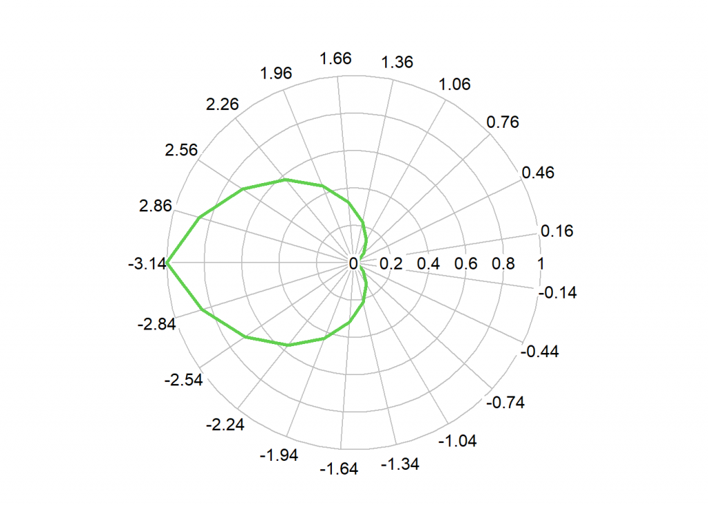
绘制极坐标
library(plotrix) t<-seq(-pi,pi,0.3) r<- 1-cos(t/2) radial.plot(r,t,rp.type=”p”,lwd=3,line.col=3)
This is an R Markdown document. Markdown is a simple formatting syntax for authoring HTML, PDF, and MS Word documents. For more details on using R Markdown see http://rmarkdown.rstudio.com.
When you click the Knit button a document will be generated that includes both content as well as the output of any embedded R code chunks within the document. You can embed an R code chunk like this:
summary(cars)
## speed dist ## Min. : 4.0 Min. : 2.00 ## 1st Qu.:12.0 1st Qu.: 26.00 ## Median :15.0 Median : 36.00 ## Mean :15.4 Mean : 42.98 ## 3rd Qu.:19.0 3rd Qu.: 56.00 ## Max. :25.0 Max. :120.00
Including Plots
You can also embed plots, for example:
Note that the echo = FALSE parameter was added to the code chunk to prevent printing of the R code that generated the plot.
-
R 正态分布密度、分布图
Untitled
2022-09-04
R Markdown
正态分布密度、分布图
x=seq(-5,5,0.1)
plot(x,dnorm(x),type=”l”) #密度函数曲线
abline(v=2.5,col=2)
plot(x,pnorm(x),type=”l”) #分布函数曲线
————-
绘制极坐标library(plotrix)
t<-seq(-pi,pi,0.3)
r<- 1-cos(t/2)
radial.plot(r,t,rp.type=”p”,lwd=3,line.col=3)summary(cars)
-
R语言方差分析
--- title: "方差分析 analysis" author: - Liu tiezhu date: '2022-08-29' documentclass: ctexart keywords: - 中文 - R Markdown output: rticles::ctex: fig_caption: yes number_sections: yes toc: yes --- ```{r setup, include=FALSE} knitr::opts_chunk$set(echo = TRUE) ``` ## Analysis with R - Explore - clean - Manipulate - Describe and summarise - Analyse ### Analyse your data ## ANOVA coding ``` {r} library(tidyverse) library (patchwork) library(gapminder) #life expect in difference area library(forcats) #data() head(gapminder) # Create a data set to work with gapdata <- gapminder %>% filter(year ==2007& continent %in% c("Americas","Europe","Asia")) %>% select(continent,lifeExp) #Take a look at the distribution of means gapdata %>% group_by(continent) %>% summarise(Mean_life=mean(lifeExp)) %>% arrange(Mean_life) #Research question: # Is the life expectancy in these three continents # Research question: Is the life expectancy in these three continents different # Hypothesis testing: HO:Mean life expectancy is the same # HI:Mean life expectancy is not the same # observation: # Difference in mean is observed in the sample data,but is this statistically # significant (alpha 0.05) # Create ANOVA mode 1 gapdata %>% aov(lifeExp ~ continent,data =.) %>% summary() aov_model <- gapdata %>% aov(lifeExp ~ continent,data =.) # Is this significance being driven by a particular continent? gapdata %>% aov(lifeExp ~ continent,data = .) %>% TukeyHSD() %>% plot() TukeyHSD(aov_model) #The difference between Asia and the Americas #has an adjusted p value of 0.14 (not significant) #and a 95%cI that overlaps 0 ``` -
R使用技巧-编程
title: “R example”
author:- 刘铁柱
documentclass: ctexart
keywords: - 中文
- R Markdown
output:
rticles::ctex:
fig_caption: yes
number_sections: yes
toc: yes
数据输入与创建数据框
#C()系列的创建
scores <- c(61,66,90,88,100)
scores

#data.frame 创建数据框
points <- data.frame(
     labels=c("Low","Mid","High"),
     ubound = c(0.674,1.64,2.33),
     lbound = c(0,0.6,1.64)
 )
points
#edit data.frame--表格方式输入数据
score <- data.frame()
score <- edit(score)
#plot
#plot(cars)
#-------------
# scan() 输入数据(数字)
x <-scan()
x
数据框列求和方法
widgets <- c(179,153,183,153,154)
gadgets <- c(167,193,190,161,181)
thingys <- c(182,166,170,171,186)
daily.prod <- data.frame(widgets,gadgets,thingys,row.names = c('Mon','Tue','Wed','Thu','Fri'))
rbind(daily.prod,Total=colSums(daily.prod))
cbind(daily.prod,Totol=rowSums(daily.prod))
digits小数位控制
pi
options(digits = 15)
print(pi,digits = 4)  #4位数字
print(100*pi,digits = 4)
cat(pi,"\n")
cat(format(pi,digits = 4),"\n") #4位数字
pnorm(-3:3)
print(pnorm(-3:3),digits = 3)
输出到文件
#cat使用
#cat("The answer is",answer,file = "filename",append = TRUE)
#cat(data,file = "filename",append = TRUE)
#sink()使用
#sink("filename")   #屏幕输出被写入文件
    #    ...other session work...
    #source("script.R")
#sink() #停止写入文件,输出到屏幕

#文件列表,目录列表
list.files()
#list.dirs()

#write 把数据写入文件
##write(x,"filename")
#write.csv(data,file = "filename",row.names = T)
读取数据
# records <- read.fwf("",widths = c(w1,w2,w3,...,w)) #固定宽度的数据格式w-宽度
# dfram <- read.table("data.txt",header=TRUE,sep = ":")
# tbl <- read.csv("filename",header=FALSE)
# tbl <- read.table("http://www.example.com/download/data.txt")  #直接读取网络数据
#
# save(mydata,file = "mydata.RData")  # 存入
# load("mydata.RData")                # 读出
不同自由的的t分布图
#pdf("t-distribution.pdf")
par(mfrow=c(2,2))
#opar=par(no.readonly = TRUE)
x=seq(-4,4,length.out=100)

par(fig=c(0,1,0,1))
d1=dt(x,2)
d2=dt(x,5)
d3=dt(x,15)
#不同自由度t分布密度曲线画在一张图上 plot和lines结合即可
plot(d1,ylim = c(0,0.4),type="l")
lines(d2,col='red')
lines(d3,col="blue")
#不同自由度t分布密度曲线画在不同的图上
plot(x,dt(x,1),type = "l",ylim = c(0,0.5))
plot(x,dt(x,3),type = "l",ylim = c(0,0.5))
plot(x,dt(x,5),type = "l",ylim = c(0,0.5))
plot(x,dt(x,10),type = "l",ylim = c(0,0.5))
plot(x,dt(x,30),type = "l",ylim = c(0,0.5))
#dev.off()
Cluster聚类分析
means <- sample(c(-3,0,3),replace = T)
x <- rnorm(99,mean = means)
d <- dist(x)
hc <- hclust(d)
plot(hc,hang=-1)
clust <- cutree(hc,k=3)
plot(x~factor(clust),main = "Class Mean")
几个R函数 list which apply lapply sapply scan cat file
list()列表
findwords <- function(tf){     #tf short for:text file
  txt <- scan(tf,"")           #读取文本文件tf内容,空格间隔的英文内容,汉字不适用
  #print(txt)                   #输出文本列表
  wl <- list()                 #创建word(单词)列表list --wl
  for (i in 1:length(txt)){    # 循环读取txt内单词
    wrd <- txt[i]
    wl[[wrd]] <- c(wl[[wrd]],i)  # wl[[wrd]是个单词位置,把位置向量存起来
  }
  return(wl)
}
#orders the output of findwords() by word frequwncy
freqwl <- function(wordlist){
  freqs <- sapply(wordlist,length)
  return(wordlist[order(freqs)])   #order()按位次排序,sort() 按值排序
}

x <- findwords("tf")
#print(x)

# names(x)     #显示列表标签名,提取x中的单词
# unlisted(x)  #获取列表的值
# unname(x)    #去掉列表元素名
#sort(names(x)) #列表标签名(单词)排序
#提取词频较高的10%单词作图
#----------------------------
snyt <- freqwl(x)
#print(snyt)
nword <- length(snyt)
#class(nword)
freqs <- sapply(snyt[round(0.9*nword):nword],length)
barplot(freqs)
列表应用lapply() & sapply()
lapply(list(1:6,20:36),median) #输出中位数1:6,20:36列表
sapply(list(1:6,20:36),median) #输出中位数1:6,20:36矩阵
which()
# which函数
# 1. 返回满足条件的向量下标
cy <- c(1,4,3,7,NA)
cy
which(cy>3)   #返回下标
cy[which(cy>3)]   #返回下标对应的值

# 2.数组中使用
ay <- array(rep(c(4,6,2,1,3,7),2),dim=c(2,3,2))
ay
which(ay>6)
which(ay>6,arr.ind=TRUE)
ay[which(ay>6,arr.ind=TRUE)]
which(ay>6,arr.ind=TRUE,useNames=F)
数据框中使用
studentID <- c(1,2,3,4,5,6)
gender <- c('M','F','M','M','F','F')
math <- c(40,60,70,60,90,60)
English <- c(98,56,78,93,79,78)
Chinese <- c(86,54,78,90,78,54)
data <- data.frame(studentID,gender,math,English,Chinese,stringsAsFactors = F)
data

which(data[,5]==78)
#挑选语文成绩为78的学生
data[which(data[,5]==78),]
#原文链接:https://blog.csdn.net/chongbaikaishi/article/details/115765282
画饼pie图
# 数据准备
info = c(1, 2, 4, 8)
# 命名
names = c("Google", "Runoob", "Taobao", "Weibo")
# 涂色(可选)
cols = c("#ED1C24","#22B14C","#FFC90E","#3f48CC")
# 计算百分比
piepercent = paste(round(100*info/sum(info)), "%")
# 绘图
pie(info, labels=piepercent, main = "网站分析", col=cols)
# 添加颜色样本(图例)标注
legend("topright", names, cex=0.8, fill=cols)
绘制气泡图 bibole
attach(mtcars)
r <- sqrt(disp/pi)
symbols(wt, mpg, circle=r, inches=0.30,
        fg="white", bg="lightblue",
        main="Bubble Plot with point size proportional to displacement",
        ylab="Miles Per Gallon",
        xlab="Weight of Car (lbs/1000)")
text(wt, mpg, rownames(mtcars), cex=0.6)
detach(mtcars)
scan and cat
rm(list=ls())
# x <- scan("")    #键盘输入数据x
# y <- scan("")    #键盘输入数据y
kids <- c("Tom","jime","cat","peter")
age <- c(23,14,26,25)
d <- data.frame(kids,age)
d
write.table(d,'kids.txt')
#getwd()
kids <- scan(file = "kids.txt",what = "") #读取文件中数据,what=‘’ 字符,默认读取实数。
kids
#scan&cat 配合file()使用
f <- file("kids",'w')
cat("12 23 56",f,append = TRUE) #向文件中追加写入
close(f)
得到要打开的文件名
f <- choose.files() print(f) - 刘铁柱
-
R数据框排序方法
v1<-c("bily","tom","jhon") v2<-c(23,45,26) #构造数据框 x<-data.frame(name=v1,age=v2,) x x[order(x$age),] x[order(x$name),] -
求函数最小值
nlm(function(x) return(3x^2-3x+1),100) 最小值
$minimum
[1] 0.25$estimate
[1] 0.4999995$gradient
[1] -2.220446e-10$code
[1] 1$iterations
[1] 2 -
R绘图ggplot及其cowplot插件
library(cowplot)
library(ggplot2)
plot.mpg <- ggplot(mpg, aes(x = cty, y = hwy, colour = factor(cyl))) +
geom_point(size=2.5)
plot.diamonds <- ggplot(diamonds, aes(clarity, fill = cut)) + geom_bar() +
theme(axis.text.x = element_text(angle=70, vjust=0.5))
plot_grid(plot.mpg, NULL, NULL, plot.diamonds, labels = c("A", "B", "C", "D"), ncol = 2)
https://blog.csdn.net/xspyzm/article/details/104345261